
WEBSITE DESIGN & DEVELOPMENT
We work hard to be website design and web development innovators. We create beautiful, user and web friendly creative designs on WordPress. We craft strategic and engaging designs that will effectively deliver your message, while captivating and converting website users into customers.
Whether you need a new website or an updated web design, let’s work together and create a memorable design that will have a lasting impact on your current and potential customers. Your website’s content matters not only for SEO purposes but also for your customers. We can help deliver this by blending beautiful design, functionality, engaging visuals, meaningful content and advanced web coding.
CUSTOM WEBSITE DESIGN
First Impressions Matter. For many businesses, your website is the single most important tool you have for gaining new business. We know how to create awesome websites designs that will keep your audience, make a positive first impression and opens new opportunities for business. Our website designs are professional and custom-built to your specific business. We plan, design, and deploy beautiful websites with the latest technologies and design styles.

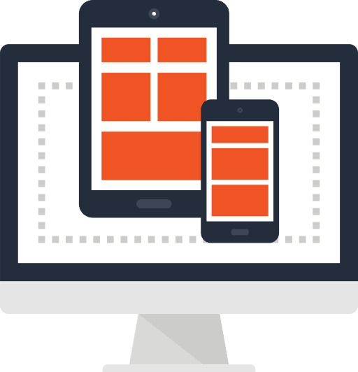
RESPONSIVE WEBSITE DESIGN
For many businesses, customers are reaching a company’s website from mobile devices and tablets. Because of the change in mobile technology, websites must be designed and developed with these devices in mind. In fact, Google rewards responsive web design. Great responsive sites allows your desktop’s website content to automatically adjust to the appropriate screen size by rearranging elements and content to display on all devices.
As smart phones and tablets continue to be a major part of our daily lives, customers and clients should be able to find your service and products quickly through an intuitive mobile design. By understanding the goals of your website, we will maximize the user’s experience by creating an interactive and easy to use mobile website without the need to continuously adjust, pan and scroll to access content.
What is Response Website Design?
Responsive web design has become a great solution to the demand on a variety of devices (iPad, laptop, etc. In the recent past (several years), website design required getting web content to fit desktop or mobile only. To make matters more difficult, many business had used website templates. The result was some terrible designs with the option of a limited content website.
As responsive website design has established itself, so has the need to improve the user’s website experience. Below are some basic principles of responsive web design here to engage users in an ever-changing web environment.
1. Flow
As screen sizes become smaller, content needs to become more vertical, content will be pushed down, this is called the flow. The flow takes design and forces it into a natural moving website.
2. Relative units
Regardless of the device, screen pixel density can also vary, so we use units that are flexible and work everywhere. We use relative units like percent’s come in handy. Objects that are set to 50% wide means it will always take half of the screen (viewport).
3. Breakpoints
Breakpoints allow the layout to change at predefined points, (i.e., 4 columns on a desktop, but only 1 column on an iPhone).
4. Max and Min values
Sometimes it’s great that content takes up the whole width of a screen. However, a mobile device and content stretching to the whole width of your TV screen looks awful. This is why Min/Max values help to properly fill the screen.
5. Nested objects
Having a lot of website elements could be difficult to control, therefore wrapping elements in a container to keep them neatly organized. Utilize static units like pixels for content that you don’t want to scale, like logos and buttons.
6. Mobile or Desktop first
Technically there isn’t much of a difference with responsive website design as far as where you begin (mobile or desktop first). Start with the end in mind. Let the website users determine the primary needs (eCommerce, registration, etc).
7. Web fonts vs System fonts
Use great web fonts, but keep it light! Remember that each will be downloaded and the more you’ll have, the longer it will take to load the page. System fonts can be far faster to load except when the user doesn’t have it locally, it will fall back to a default font.
8. Bitmap images vs Vectors
Images with details and fancy effects applied should be used in a bitmap. For bitmaps use a jpg, png or a gif. For vector images the best choice would be a SVG or an icon font. Both offer has some benefits and some drawbacks depending on the application.
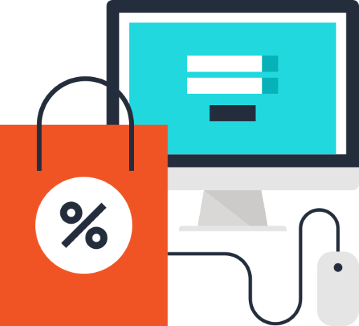
eCOMMERCE WEBSITE DESIGN
Ready for an awesome e-commerce websites. Want an awesome e-commerce website design that can help sell your services and products easily online. You can depend on the fastest, most secure and flexible e-commerce solutions. Regardless of the number of products you offer, we will integrate the best e-commerce shopping cart solutions for your online store.
Powerful features that include unlimited products and categories, secure checkout and customer reviews, our e-Commerce website designs are an easy all-in-one solution. You will find our eCommerce website designs are specially designed to provide your customers with an easy, simple and functional online shopping experience. We can create an amazing shopping experience that your customers will appreciate.
RESPONSIVE WEBSITE DESIGN
WEBSITE CONTENT STRATEGY
COMPETITION ANALYSIS
WORDPRESS PLATFORM
THEME INSTALLATION & SETUP
USER EXPERIENCE DESIGN
WEBSITE MAINTENANCE
MULTI BROWSER TESTING
gOOGLE aNALYTICS
STRATEGY
Design
DEVELOP
DEPLOY
GET A FREE CONSULTATION
Let’s chat or sit down and find out if your website design, website ranking and digital advertising and marketing strategy is meeting your goals. If you don’t have reliable analytics in place with measurable goals, you should call us today!